

Can you use R-algorithms in SAP Analytics Cloud? Yes you can!
In SAP Analytics Cloud (SAC) you have the ability to include R components. In this blog I wanted to try my hand and use the best run demo data to see what I can create. Using R I want to create a visual and add some analysis to the data.
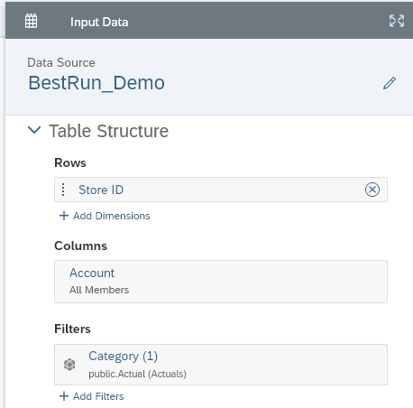
After you added a R component to the canvas first attach a datasource. I added the BestRun_Demo data and selected the Store ID column.
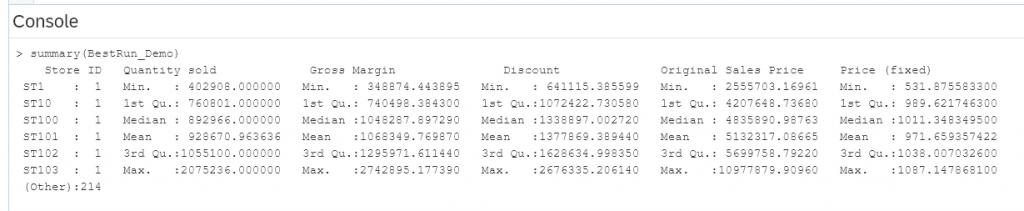
Once you are in the script of the R component you can enter commands and in the console you get information. For example if you type in this command
summary(BestRun_Demo)
Then the console will give you the following answer.
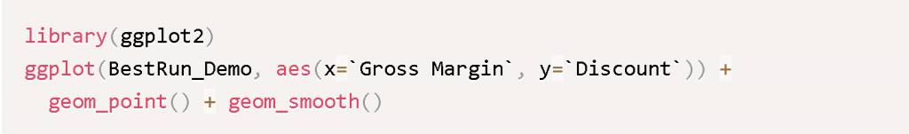
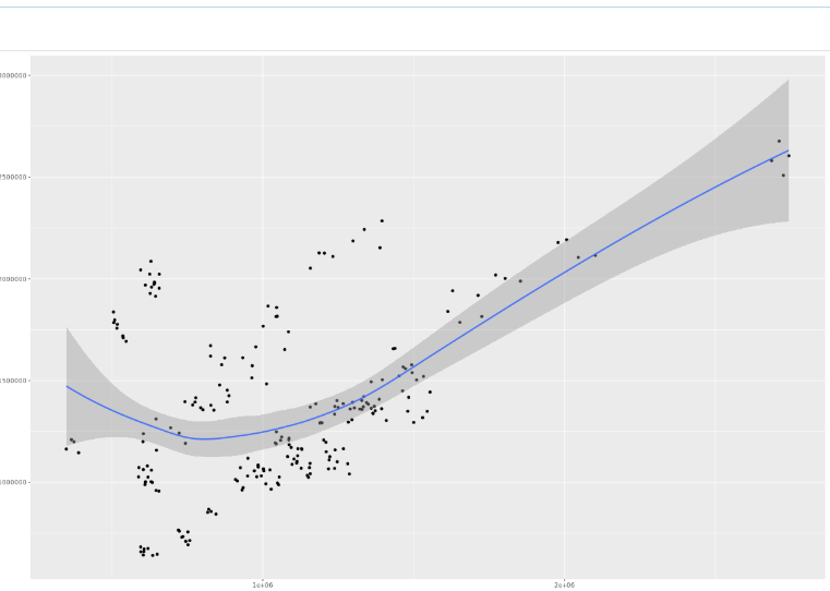
But the goal today is to see if we can create a nice graph. For that you have libraries available in R. One of those libraries is ggplot which is to create visuals. Lets just start with a basic command for a graph to create a scatter plot where we map Gross Margin vs Discount. We do expact that there is a relation between the two.
Using geom_smoot you can add a trendline with a confidence level (the shaded area). In this case it does not look that impressive. The data seems to be grouped and the trendline is not really a good fit to the data.
Kmeans
To create groups we will use Kmeans.
This is the definition of k-means
K-means clustering is a simple unsupervised learning algorithm that is used to solve clustering problems. It follows a simple procedure of classifying a given data set into a number of clusters, defined by the letter “k,” which is fixed beforehand. The clusters are then positioned as points and all observations or data points are associated with the nearest cluster, computed, adjusted and then the process starts over using the new adjustments until a desired result is reached.
K-means clustering has uses in search engines, market segmentation, statistics and even astronomy.
Source: Technopedia: https://www.techopedia.com/definition/32057/k-means-clustering
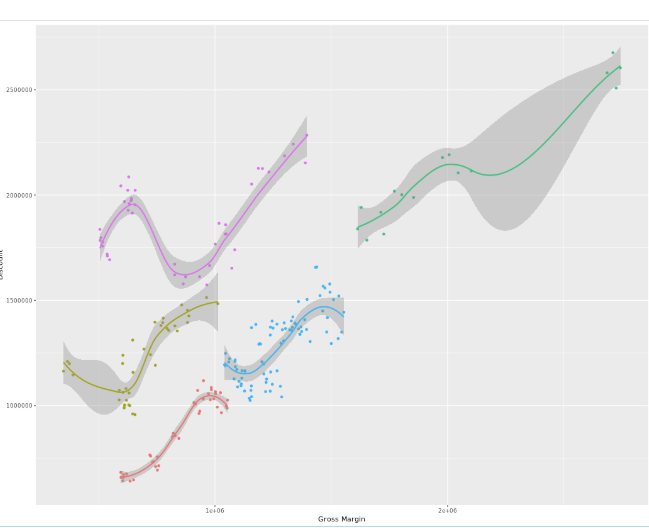
So a simple way to group into clusters, you have to tell it how many groups you expect.
We want to group based on the Gross Margin the Discount and the ratio between the two. The latter because the cloud seems to be diagonal and a ratio will help Kmeans to group the dots more diagonally. Note that I use a function scale to set the kmeandata. This will get everything to the same scale. That avoids the issue that larger numbers in a dimension have a larger impact.
Finally in the ggplot I use factor to tell ggplot that this is not a continuous variable but 4 separate categories.
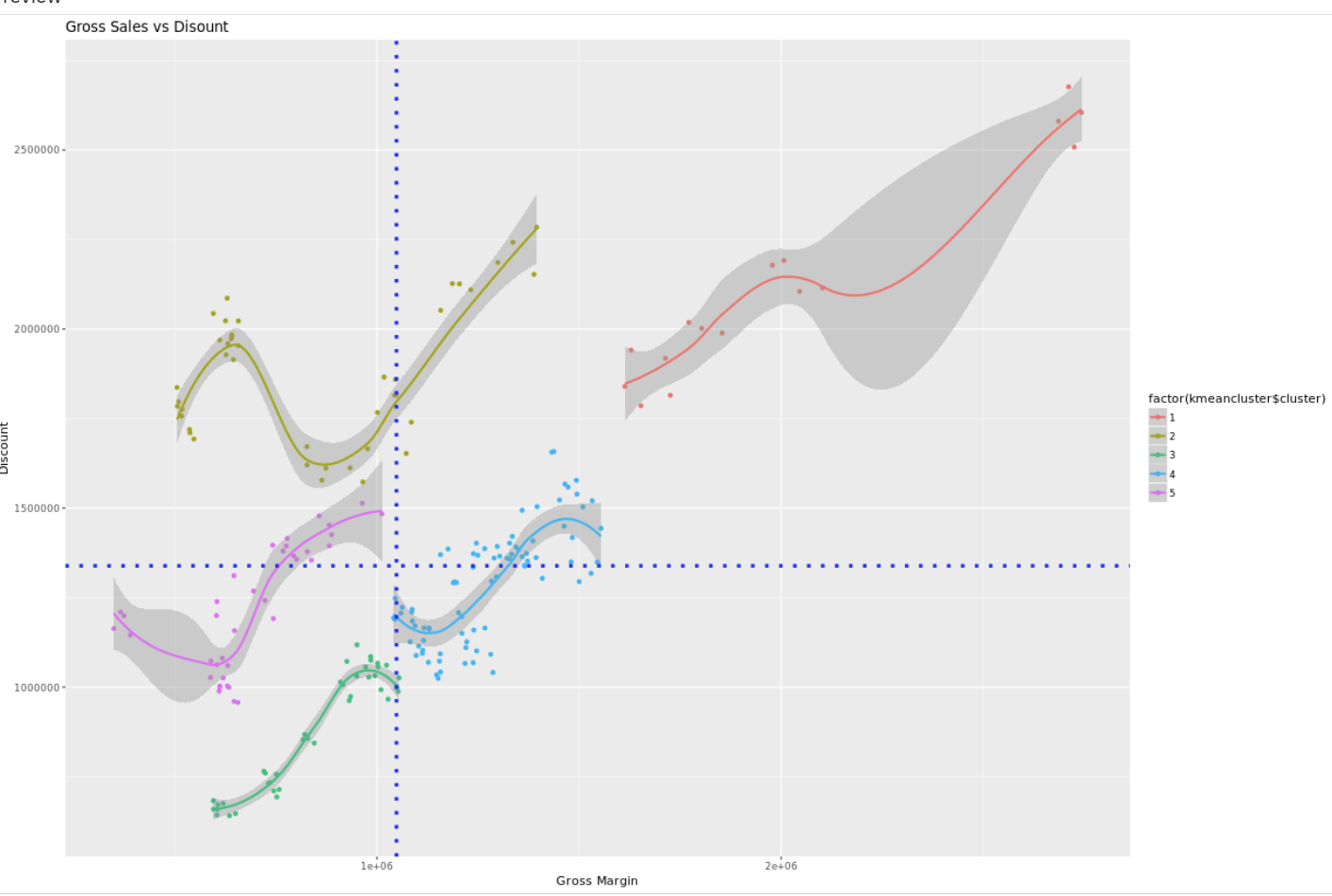
The result now shows for each group a separate color and the trendline has the same color as the group. The trendlines also seem to fit the data better. Perhaps with the exception of the green group where the line connect two separate groups of dots. But for know we just go with that ?
Finalizing
Now we got some nice grouping, some trendlines that make sense. Let’s finish this off with a title and create some segments. I will add a vertical line and a horizontal line as well, creating four areas based on the median of the Gross Margin and the Discount.
+ ggtitle(“Gross Sales vs Disount”)
+ geom_hline(yintercept = median(BestRun_Demo$`Discount`), linetype=”dotted”,
color = “blue”, size=1.5)
+ geom_vline(xintercept = median(BestRun_Demo$`Gross Margin`), linetype=”dotted”, color = “blue”, size=1.5)

And this is the final product. A quite complex graph. Ggplot allows you to start with a graph and add more and more elements to the canvas. It’s a nice way to add this.
Final thoughts. With all of the libraries that are standard in the R server you have a large number of options that you can work out, not only can you create visuals, but additionally you can do some machine learning like kmeans. All in all there are a wealth of options available either in a story or in an analytic application.