

Getting things rolling, visualising data in SAP Datawarehouse Cloud (2/2)!
In the latest blog, Ronald and Tim demonstrated how easy it is to connect SAP Data Warehouse Cloud via a Data Provisioning Agent to an on-premise HANA and BW/4HANA system. You can find the blog here,
Using the Data Builder, they created a view that consists out of remote and local tables, joins and filters and created a story using the Story Builder
In this blog I will tell you more about how you can use the ‘Story Builder’ to visualize your data. And yes, spoiler alert, it looks just like SAP Analytics Cloud. Oh wait, it is SAP Analytics Cloud! And yes, it’s the answer to all your modelling needs!
Story Builder
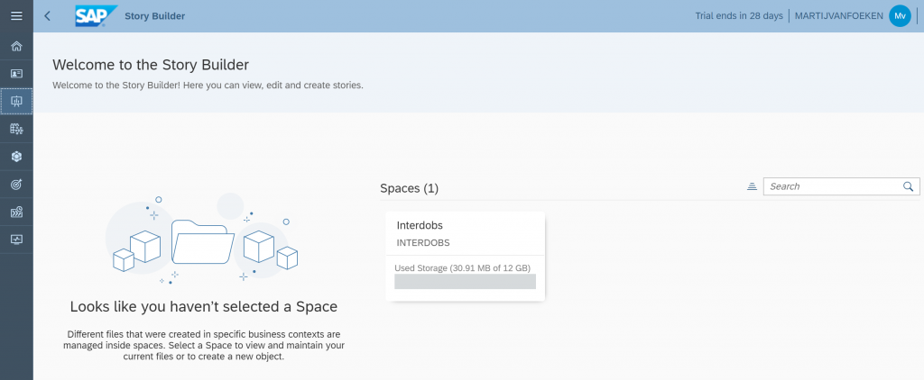
The place to be when you want to visualize your data managed in SAP Data Warehouse Cloud is the ‘Story Builder’, accessible from the left panel. From here you can view, edit and create stories. First action is to select the ‘Space’ that contains the data you want to visualize.
To be able to create a story, you need to ensure you have the BI Content Creator role assigned to your user via Security – Users.
When you click on ‘Create Story’ you will be prompted to ‘Select Your Data’. In this scenario we select the ‘308 Terugroep Actie’ dataset and click ‘OK’. After selecting the dataset, the workflow will open an embedded version of SAP Analytics Cloud. And guess what, it offers almost all the available functionality in a stand-alone tenant! Which is quite neat since this is only a beta release.
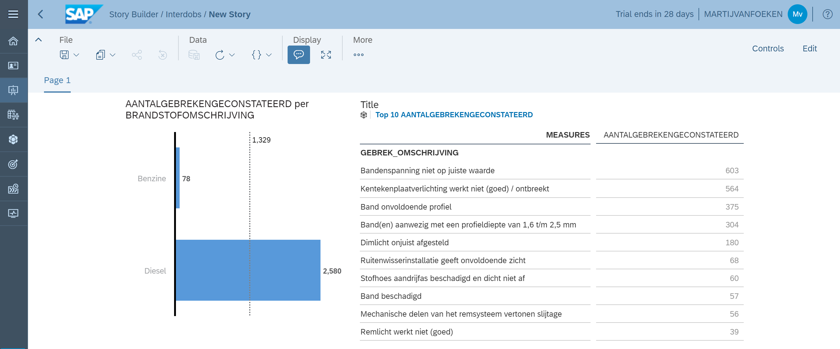
Now let’s start visualizing with adding a new chart to the canvas. By default, a horizontal bar/column chart is added, and from there you can start adding measures and dimensions from the selected dataset.
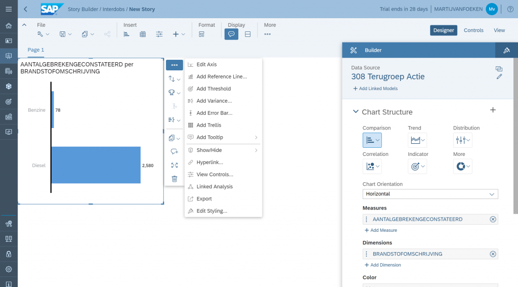
In this example we visualize how failures are split across different fuel types for this car. On the right side of the chart you see shortcut icons to enable features like sorting and ranking but also menu items to directly add, for instance a Reference Line or create a Linked Analysis.
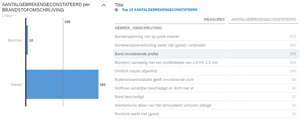
Let’s add a table as second widget to the canvas to display the top 10 details on the failures found by applying a rank. Now we setup Linked Analysis so we can create interaction between the visualizations, just out-of-the-box.

We select the table and click on Linked Analysis. We want all visualizations to change when an item in the table is selected. Now if we go to view mode and select a row in the table, the numbers in the bar chart are updated instantly.
Of course, this blog could contain much more examples of all the cool things we can do with SAP Analytics Cloud. But let’s take a step back and think about what the introduction of SAP Data Warehouse Cloud means for SAP Analytics Cloud use cases.
With the introduction of SAP Data Warehouse Cloud, SAP is adding a cloud-based data modelling environment to their portfolio which enables end-users to model their data, regardless whether it’s on-premise or cloud, without the need for IT to help. Power users can upload data, combine it to a single data model and consume it without having to add a single line of code. A true end-to-end solution! If you have the connection and the credentials, the world lies at your feet!
I’m looking forward exploring more use cases using SAP Data Warehouse Cloud and to talk to the development team and product managers at SAP TechEd Las Vegas so we can provide you with the latest updates.
Stay tuned for more!